Css Module 17
If You want To Earn Certificate For My All Course Then Contact Me At My Contact Page then I Will Take A Test And Give You certificate
Click Here To Visit
Css Module 17
If You want To Earn Certificate For My All Course Then Contact Me At My Contact Page then I Will Take A Test And Give You certificate
Click Here To Visit
Module 17 : CSS Animations – Keyframe Animations, Animation Timing, and Animation Properties
CSS animations allow web developers to create smooth, visually appealing transitions and effects without relying on JavaScript or third-party libraries. This module provides a deep dive into CSS animations, covering keyframe animations, animation timing, and essential animation properties. It includes detailed explanations, practical examples, exercises, and guidance to help learners master CSS animations.

1. Introduction to CSS Animations
CSS animations enable the movement and transformation of elements over time using only CSS properties. There are two primary ways to create animations in CSS:
Transitions: Used for simple animations triggered by user interactions (e.g., hover).
Keyframe Animations: Used for complex animations that require more control over the movement of elements.
This module focuses on keyframe animations and related animation properties.
2. Keyframe Animations in CSS
A keyframe animation defines multiple steps in an animation sequence. The syntax follows this structure:
Syntax of @keyframes
@keyframes animationName {
0% {
/* Starting state */
}
50% {
/* Midway state */
}
100% {
/* Ending state */
}
}
Example: Creating a Bouncing Ball Animation
Let's animate a ball to move up and down infinitely:

.ball {
width: 50px;
height: 50px;
background-color: red;
border-radius: 50%;
position: absolute;
bottom: 0;
animation: bounce 2s infinite ease-in-out;
}
@keyframes bounce {
0%, 100% {
transform: translateY(0);
}
50% {
transform: translateY(-200px);
}
}
Explanation:
0% and 100%: The ball is at its starting position.
50%: The ball moves 200px up.
animation: bounce 2s infinite ease-in-out;
bounce: The name of the keyframe animation.
2s: The animation duration.
infinite: The animation repeats indefinitely.
ease-in-out: The animation starts and ends slowly.
3. Animation Timing Functions
CSS provides various timing functions to control the speed of animation:
Function Description
linear Moves at a constant speed.
ease Starts slow, speeds up, then slows down. (default)
ease-in Starts slow, then speeds up.

ease-out Starts fast, then slows down.
ease-in-out Starts and ends slow, fast in the middle.
cubic-bezier(n,n,n,n) Custom timing function for precise control.
Example: Different Timing Functions on Boxes
.box {
width: 50px;
height: 50px;
background-color: blue;
margin: 10px;
animation: moveBox 3s infinite;
}
.linear { animation-timing-function: linear; }
.ease { animation-timing-function: ease; }
.ease-in { animation-timing-function: ease-in; }
.ease-out { animation-timing-function: ease-out; }
.ease-in-out { animation-timing-function: ease-in-out; }
@keyframes moveBox {
from { transform: translateX(0); }
to { transform: translateX(300px); }
}
This example applies different timing functions to different .box elements to observe their effects.
4. CSS Animation Properties
CSS animations have several properties to control their behavior:
1. animation-name
Defines the name of the @keyframes animation.
animation-name: bounce;
2. animation-duration
Sets how long the animation lasts.

animation-duration: 2s;
3. animation-timing-function
Controls the acceleration and deceleration of animation.
animation-timing-function: ease-in-out;
4. animation-delay
Delays the animation before it starts.
animation-delay: 1s;
5. animation-iteration-count
Specifies how many times the animation repeats (infinite for continuous looping).
animation-iteration-count: infinite;
6. animation-direction
Defines whether the animation plays normally, in reverse, or alternates:
Value Description
normal Plays from start to end.
reverse Plays from end to start.
alternate Plays forward, then reverses.
alternate-reverse Plays in reverse first, then forward.
animation-direction: alternate;
7. animation-fill-mode
Determines if the animation applies styles before and after execution:
Value Description
none Default behavior, no extra styling.
forwards Keeps the last keyframe state after animation ends.
backwards Applies first keyframe style before animation starts.
both Combines forwards and backwards.
animation-fill-mode: forwards;
8. animation shorthand
Instead of defining each property separately, use a shorthand notation:
animation: bounce 2s ease-in-out 1s infinite alternate;
Order: animation-name duration timing-function delay iteration-count direction fill-mode
5. Practical Exercises

Exercise 1: Create a Pulsing Button
Task: Animate a button to pulse when hovered.
.button {
background-color: blue;
color: white;
padding: 10px 20px;
border: none;
cursor: pointer;
font-size: 16px;
border-radius: 5px;
animation: pulse 2s infinite;
}
@keyframes pulse {
0% { transform: scale(1); }
50% { transform: scale(1.1); }
100% { transform: scale(1); }
}
Exercise 2: Loading Spinner
Task: Create a rotating loading spinner.
.loader {
width: 50px;
height: 50px;
border: 5px solid lightgray;
border-top: 5px solid blue;
border-radius: 50%;
animation: spin 1s linear infinite;
}
@keyframes spin {
0% { transform: rotate(0deg); }
100% { transform: rotate(360deg); }
}
6. Summary and Best Practices
Use keyframes for complex animations.
Choose timing functions based on animation feel.
Use shorthand notation for cleaner code.
Avoid excessive animations to prevent performance issues.
Use animation-fill-mode: forwards; to keep the final state.
This module provides a complete guide with practical exercises to help students understand and apply CSS animations effectively. It is suitable for beginners and intermediate learners who want to enhance their web designs with smooth animations.
Css Module 16
If You want To Earn Certificate For My All Course Then Contact Me At My Contact Page then I Will Take A Test And Give You certificate
Click Here To Visit
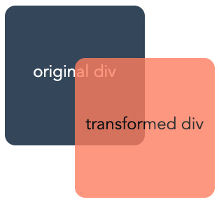
Module 16 : CSS Transformations – Translate, Scale, Rotate, and Skew Elements
CSS transformations allow you to manipulate elements by moving, resizing, rotating, and skewing them in a two-dimensional or three-dimensional space. These transformations are essential for creating dynamic and interactive web designs.
1. Introduction to CSS Transformations
CSS transformations enable the modification of an element's appearance without affecting the document flow. They are applied using the transform property, which supports various functions like translate(), scale(), rotate(), and skew().
Syntax of CSS Transformations
.element {
transform: function(value);
}
.element: The target element to be transformed.
function(value): Specifies the transformation to be applied.
2. Transform Functions in Detail
2.1. Translate (Moving Elements)
The translate() function moves an element from its original position along the X and Y axes. It does not affect surrounding elements.
Syntax:
.element {
transform: translate(x, y);
}
x: Moves the element horizontally (positive values move right, negative move left).
y: Moves the element vertically (positive values move down, negative move up).
Example:
.box {
width: 100px;
height: 100px;
background-color: blue;
transform: translate(50px, 20px);
}
Explanation:
The .box element moves 50px to the right and 20px down.
If y is omitted (translate(50px)), it defaults to 0.
Exercise:
Try modifying the translate values and observe the element's movement:
transform: translate(-30px, 100px);
2.2. Scale (Resizing Elements)
The scale() function resizes an element along the X and Y axes.
Syntax:
.element {
transform: scale(x, y);
}
x: Scale factor along the horizontal axis.
y: Scale factor along the vertical axis (optional; if omitted, x is used for both).
Example:
.box {
width: 100px;
height: 100px;
background-color: green;
transform: scale(1.5, 2);
}
Explanation:
1.5 increases width by 150%.
2 increases height by 200%.
Exercise:
Try shrinking an element by setting scale values below 1:
transform: scale(0.5, 0.5);
2.3. Rotate (Rotating Elements)
The rotate() function rotates an element clockwise or counterclockwise.
Syntax:
.element {
transform: rotate(angle);
}
angle: Rotation in degrees (deg), radians (rad), or gradians (grad).
Example:
.box {
width: 100px;
height: 100px;
background-color: red;
transform: rotate(45deg);
}
Explanation:
Rotates the .box 45 degrees clockwise.
Negative values rotate counterclockwise (-45deg).
Exercise:
Try rotating an element by different angles:
transform: rotate(90deg);
transform: rotate(-30deg);
2.4. Skew (Tilting Elements)
The skew() function tilts an element along the X and Y axes.
Syntax:
.element {
transform: skew(x-angle, y-angle);
}
x-angle: Skew along the X-axis.
y-angle: Skew along the Y-axis.
Example:
.box {
width: 100px;
height: 100px;
background-color: purple;
transform: skew(20deg, 10deg);
}
Explanation:
20deg skews along the X-axis.
10deg skews along the Y-axis.
Exercise:
Try skewing in only one direction:
transform: skewX(30deg);
transform: skewY(-15deg);
3. Combining Multiple Transformations
You can combine multiple transformations in a single transform property.
Example:
.box {
width: 100px;
height: 100px;
background-color: orange;
transform: translate(50px, 50px) rotate(45deg) scale(1.5);
}
Explanation:
Moves the element 50px right and 50px down.
Rotates 45 degrees.
Scales 150%.
Exercise:
Try different transformation combinations:
transform: rotate(30deg) translate(20px, 10px) scale(0.8);
4. Transform Origin (Setting the Pivot Point)
By default, transformations apply from the center. You can change this using transform-origin.
Syntax:
.element {
transform-origin: x y;
}
x: Horizontal position (left, center, right, or pixels).
y: Vertical position (top, center, bottom, or pixels).
Example:
.box {
width: 100px;
height: 100px;
background-color: cyan;
transform-origin: top left;
transform: rotate(45deg);
}
Explanation:
The .box rotates 45 degrees from the top-left corner instead of the center.
Exercise:
Try different origins:
transform-origin: bottom right;
transform-origin: 50px 50px;
5. Applying Transitions for Smooth Effects
To make transformations smooth, use transition.
Example:
.box {
width: 100px;
height: 100px;
background-color: brown;
transition: transform 0.5s ease-in-out;
}
.box:hover {
transform: scale(1.5) rotate(30deg);
}
Explanation:
The .box smoothly scales and rotates on hover.
ease-in-out creates a gradual effect.
Exercise:
Try different durations and easing functions:
transition: transform 1s linear;
6. Practical Exercises
Exercise 1: Create a Hover Animation
Goal: Create a button that moves up slightly on hover.
CSS:
.button {
padding: 10px 20px;
background-color: #3498db;
color: white;
border: none;
cursor: pointer;
transition: transform 0.3s ease;
}
.button:hover {
transform: translateY(-5px);
}
Exercise 2: Create a Rotating Loading Icon
Goal: Create a continuously rotating loader.
CSS:
.loader {
width: 50px;
height: 50px;
border: 5px solid #f3f3f3;
border-top: 5px solid #3498db;
border-radius: 50%;
animation: spin 1s linear infinite;
}
@keyframes spin {
from { transform: rotate(0deg); }
to { transform: rotate(360deg); }
}
Conclusion
CSS transformations (translate, scale, rotate, and skew) allow you to manipulate elements dynamically. By combining transformations with transition and animation, you can create visually appealing effects for web design.
Css Module 15
If You want To Earn Certificate For My All Course Then Contact Me At My Contact Page then I Will Take A Test And Give You certificate
Click Here To Visit
Module 15 : CSS Transitions – Animating CSS Properties
Introduction to CSS Transitions
CSS transitions allow you to animate changes in CSS properties over a duration, creating smooth visual effects. Instead of abrupt changes, transitions enable elements to gradually shift from one state to another. This is useful for hover effects, interactive UI elements, and enhancing user experience.
Key Concepts of CSS Transitions
Transition Properties: CSS transitions work on properties that have numerical values (e.g., opacity, width, height, background-color).
Transition Timing: The duration and easing function affect how smooth the transition appears.
Triggering Transitions: Transitions occur when an element's CSS property changes due to user interaction (hover, focus, active) or JavaScript.
Basic Syntax of CSS Transitions
selector {
transition: property duration timing-function delay;
}
property: The CSS property to animate (e.g., width, opacity).
duration: The time the transition takes (e.g., 0.5s, 1s).
timing-function (optional): Defines the speed curve (ease, linear, ease-in, ease-out, ease-in-out).
delay (optional): Time before the transition starts (e.g., 0s, 0.2s).
1. Simple CSS Transition Example
Example 1: Hover Effect on a Button
<!DOCTYPE html>
<html lang="en">
<head>
<meta charset="UTF-8">
<meta name="viewport" content="width=device-width, initial-scale=1.0">
<title>CSS Transition Example</title>
<style>
.button {
background-color: blue;
color: white;
padding: 15px 30px;
font-size: 18px;
border: none;
cursor: pointer;
transition: background-color 0.5s ease-in-out;
}
.button:hover {
background-color: red;
}
</style>
</head>
<body>
<button class="button">Hover Me</button>
</body>
</html>
Explanation:
When the user hovers over the button, its background color smoothly changes from blue to red in 0.5 seconds.
The transition effect is defined using transition: background-color 0.5s ease-in-out;.
2. Multiple Properties Transition
Example 2: Animating Multiple CSS Properties
.box {
width: 100px;
height: 100px;
background-color: green;
transition: width 1s, height 1s, background-color 1s;
}
.box:hover {
width: 200px;
height: 200px;
background-color: orange;
}
Explanation:
The box expands in width and height and changes color when hovered over.
Each property (width, height, background-color) transitions over 1s.
3. Using Different Timing Functions
Example 3: Comparing Timing Functions

.box {
width: 100px;
height: 100px;
background-color: purple;
transition: width 2s ease-in-out;
}
.box:hover {
width: 300px;
}
Timing Function Effects:
ease: Starts slow, speeds up, then slows down at the end.
linear: Moves at a constant speed.
ease-in: Starts slow, then speeds up.
ease-out: Starts fast, then slows down.
ease-in-out: Starts and ends slowly, with a speed-up in the middle.
4. Adding Delays to Transitions
Example 4: Delaying an Animation Start

.box {
width: 100px;
height: 100px;
background-color: cyan;
transition: background-color 2s ease-in-out 1s;
}
.box:hover {
background-color: pink;
}
Explanation:
The background color change starts after a 1-second delay.
5. Transitioning Transformations
Example 5: Scale and Rotate on Hover
.box {
width: 100px;
height: 100px;
background-color: red;
transition: transform 0.5s ease-in-out;
}
.box:hover {
transform: scale(1.5) rotate(45deg);
}
Explanation:
The box grows (scale(1.5)) and rotates (rotate(45deg)) on hover.
The transition is applied to the transform property over 0.5 seconds.
6. Transition with JavaScript Event Listener
Example 6: Changing Background Color Dynamically

<!DOCTYPE html>
<html lang="en">
<head>
<meta charset="UTF-8">
<meta name="viewport" content="width=device-width, initial-scale=1.0">
<title>CSS Transition with JavaScript</title>
<style>
.box {
width: 100px;
height: 100px;
background-color: blue;
transition: background-color 1s ease-in-out;
}
</style>
</head>
<body>
<div class="box" id="colorBox"></div>
<button onclick="changeColor()">Click Me</button>
<script>
function changeColor() {
document.getElementById("colorBox").style.backgroundColor = "yellow";
}
</script>
</body>
</html>
Explanation:
Clicking the button changes the box color from blue to yellow smoothly using JavaScript.
Exercises & Lab Experiments
Exercise 1: Create a Smooth Dropdown Menu
Create a navigation menu with a hidden dropdown.
Use CSS transitions to make the dropdown slide down when hovered.

Exercise 2: Animate a Loading Bar
Create a div representing a loading bar.
Use CSS transitions to animate the width from 0% to 100%.
Lab Experiment: Interactive Card Flip Animation
Create a card with a front and back side.
Use CSS transitions to flip the card on hover using transform: rotateY(180deg).
Example Code:
.card {
width: 200px;
height: 300px;
perspective: 1000px;
}
.card-inner {
width: 100%;
height: 100%;
position: relative;
transform-style: preserve-3d;
transition: transform 0.6s ease-in-out;
}
.card:hover .card-inner {
transform: rotateY(180deg);
}
.card-front, .card-back {
position: absolute;
width: 100%;
height: 100%;
backface-visibility: hidden;
}
.card-back {
background-color: yellow;
transform: rotateY(180deg);
}
Explanation:
The card smoothly flips when hovered, creating a 3D effect.
Conclusion
CSS transitions are a powerful tool for creating engaging UI animations without JavaScript. They enhance the user experience with smooth effects, and by combining them with transforms, timing functions, and delays, developers can achieve professional animations.
Module 38 : Responsive & Advanced Tables. 1. Introduction to Tables in Web Design Tables are used to display structured, relational d...


