Module 16 : CSS Transformations – Translate, Scale, Rotate, and Skew Elements
CSS transformations allow you to manipulate elements by moving, resizing, rotating, and skewing them in a two-dimensional or three-dimensional space. These transformations are essential for creating dynamic and interactive web designs.
1. Introduction to CSS Transformations
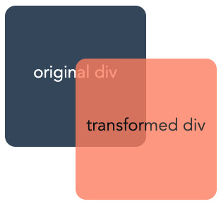
CSS transformations enable the modification of an element's appearance without affecting the document flow. They are applied using the transform property, which supports various functions like translate(), scale(), rotate(), and skew().
Syntax of CSS Transformations
.element {
transform: function(value);
}
.element: The target element to be transformed.
function(value): Specifies the transformation to be applied.
2. Transform Functions in Detail
2.1. Translate (Moving Elements)
The translate() function moves an element from its original position along the X and Y axes. It does not affect surrounding elements.
Syntax:
.element {
transform: translate(x, y);
}
x: Moves the element horizontally (positive values move right, negative move left).
y: Moves the element vertically (positive values move down, negative move up).
Example:
.box {
width: 100px;
height: 100px;
background-color: blue;
transform: translate(50px, 20px);
}
Explanation:
The .box element moves 50px to the right and 20px down.
If y is omitted (translate(50px)), it defaults to 0.
Exercise:
Try modifying the translate values and observe the element's movement:
transform: translate(-30px, 100px);
2.2. Scale (Resizing Elements)
The scale() function resizes an element along the X and Y axes.
Syntax:
.element {
transform: scale(x, y);
}
x: Scale factor along the horizontal axis.
y: Scale factor along the vertical axis (optional; if omitted, x is used for both).
Example:
.box {
width: 100px;
height: 100px;
background-color: green;
transform: scale(1.5, 2);
}
Explanation:
1.5 increases width by 150%.
2 increases height by 200%.
Exercise:
Try shrinking an element by setting scale values below 1:
transform: scale(0.5, 0.5);
2.3. Rotate (Rotating Elements)
The rotate() function rotates an element clockwise or counterclockwise.
Syntax:
.element {
transform: rotate(angle);
}
angle: Rotation in degrees (deg), radians (rad), or gradians (grad).
Example:
.box {
width: 100px;
height: 100px;
background-color: red;
transform: rotate(45deg);
}
Explanation:
Rotates the .box 45 degrees clockwise.
Negative values rotate counterclockwise (-45deg).
Exercise:
Try rotating an element by different angles:
transform: rotate(90deg);
transform: rotate(-30deg);
2.4. Skew (Tilting Elements)
The skew() function tilts an element along the X and Y axes.
Syntax:
.element {
transform: skew(x-angle, y-angle);
}
x-angle: Skew along the X-axis.
y-angle: Skew along the Y-axis.
Example:
.box {
width: 100px;
height: 100px;
background-color: purple;
transform: skew(20deg, 10deg);
}
Explanation:
20deg skews along the X-axis.
10deg skews along the Y-axis.
Exercise:
Try skewing in only one direction:
transform: skewX(30deg);
transform: skewY(-15deg);
3. Combining Multiple Transformations
You can combine multiple transformations in a single transform property.
Example:
.box {
width: 100px;
height: 100px;
background-color: orange;
transform: translate(50px, 50px) rotate(45deg) scale(1.5);
}
Explanation:
Moves the element 50px right and 50px down.
Rotates 45 degrees.
Scales 150%.
Exercise:
Try different transformation combinations:
transform: rotate(30deg) translate(20px, 10px) scale(0.8);
4. Transform Origin (Setting the Pivot Point)
By default, transformations apply from the center. You can change this using transform-origin.
Syntax:
.element {
transform-origin: x y;
}
x: Horizontal position (left, center, right, or pixels).
y: Vertical position (top, center, bottom, or pixels).
Example:
.box {
width: 100px;
height: 100px;
background-color: cyan;
transform-origin: top left;
transform: rotate(45deg);
}
Explanation:
The .box rotates 45 degrees from the top-left corner instead of the center.
Exercise:
Try different origins:
transform-origin: bottom right;
transform-origin: 50px 50px;
5. Applying Transitions for Smooth Effects
To make transformations smooth, use transition.
Example:
.box {
width: 100px;
height: 100px;
background-color: brown;
transition: transform 0.5s ease-in-out;
}
.box:hover {
transform: scale(1.5) rotate(30deg);
}
Explanation:
The .box smoothly scales and rotates on hover.
ease-in-out creates a gradual effect.
Exercise:
Try different durations and easing functions:
transition: transform 1s linear;
6. Practical Exercises
Exercise 1: Create a Hover Animation
Goal: Create a button that moves up slightly on hover.
CSS:
.button {
padding: 10px 20px;
background-color: #3498db;
color: white;
border: none;
cursor: pointer;
transition: transform 0.3s ease;
}
.button:hover {
transform: translateY(-5px);
}
Exercise 2: Create a Rotating Loading Icon
Goal: Create a continuously rotating loader.
CSS:
.loader {
width: 50px;
height: 50px;
border: 5px solid #f3f3f3;
border-top: 5px solid #3498db;
border-radius: 50%;
animation: spin 1s linear infinite;
}
@keyframes spin {
from { transform: rotate(0deg); }
to { transform: rotate(360deg); }
}
Conclusion
CSS transformations (translate, scale, rotate, and skew) allow you to manipulate elements dynamically. By combining transformations with transition and animation, you can create visually appealing effects for web design.


No comments:
Post a Comment