Module 15 : CSS Transitions – Animating CSS Properties
Introduction to CSS Transitions
CSS transitions allow you to animate changes in CSS properties over a duration, creating smooth visual effects. Instead of abrupt changes, transitions enable elements to gradually shift from one state to another. This is useful for hover effects, interactive UI elements, and enhancing user experience.
Key Concepts of CSS Transitions
Transition Properties: CSS transitions work on properties that have numerical values (e.g., opacity, width, height, background-color).
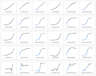
Transition Timing: The duration and easing function affect how smooth the transition appears.
Triggering Transitions: Transitions occur when an element's CSS property changes due to user interaction (hover, focus, active) or JavaScript.
Basic Syntax of CSS Transitions
selector {
transition: property duration timing-function delay;
}
property: The CSS property to animate (e.g., width, opacity).
duration: The time the transition takes (e.g., 0.5s, 1s).
timing-function (optional): Defines the speed curve (ease, linear, ease-in, ease-out, ease-in-out).
delay (optional): Time before the transition starts (e.g., 0s, 0.2s).
1. Simple CSS Transition Example
Example 1: Hover Effect on a Button
<!DOCTYPE html>
<html lang="en">
<head>
<meta charset="UTF-8">
<meta name="viewport" content="width=device-width, initial-scale=1.0">
<title>CSS Transition Example</title>
<style>
.button {
background-color: blue;
color: white;
padding: 15px 30px;
font-size: 18px;
border: none;
cursor: pointer;
transition: background-color 0.5s ease-in-out;
}
.button:hover {
background-color: red;
}
</style>
</head>
<body>
<button class="button">Hover Me</button>
</body>
</html>
Explanation:
When the user hovers over the button, its background color smoothly changes from blue to red in 0.5 seconds.
The transition effect is defined using transition: background-color 0.5s ease-in-out;.
2. Multiple Properties Transition
Example 2: Animating Multiple CSS Properties
.box {
width: 100px;
height: 100px;
background-color: green;
transition: width 1s, height 1s, background-color 1s;
}
.box:hover {
width: 200px;
height: 200px;
background-color: orange;
}
Explanation:
The box expands in width and height and changes color when hovered over.
Each property (width, height, background-color) transitions over 1s.
3. Using Different Timing Functions
Example 3: Comparing Timing Functions
.box {
width: 100px;
height: 100px;
background-color: purple;
transition: width 2s ease-in-out;
}
.box:hover {
width: 300px;
}
Timing Function Effects:
ease: Starts slow, speeds up, then slows down at the end.
linear: Moves at a constant speed.
ease-in: Starts slow, then speeds up.
ease-out: Starts fast, then slows down.
ease-in-out: Starts and ends slowly, with a speed-up in the middle.
4. Adding Delays to Transitions
Example 4: Delaying an Animation Start
.box {
width: 100px;
height: 100px;
background-color: cyan;
transition: background-color 2s ease-in-out 1s;
}
.box:hover {
background-color: pink;
}
Explanation:
The background color change starts after a 1-second delay.
5. Transitioning Transformations
Example 5: Scale and Rotate on Hover
.box {
width: 100px;
height: 100px;
background-color: red;
transition: transform 0.5s ease-in-out;
}
.box:hover {
transform: scale(1.5) rotate(45deg);
}
Explanation:
The box grows (scale(1.5)) and rotates (rotate(45deg)) on hover.
The transition is applied to the transform property over 0.5 seconds.
6. Transition with JavaScript Event Listener
Example 6: Changing Background Color Dynamically
<!DOCTYPE html>
<html lang="en">
<head>
<meta charset="UTF-8">
<meta name="viewport" content="width=device-width, initial-scale=1.0">
<title>CSS Transition with JavaScript</title>
<style>
.box {
width: 100px;
height: 100px;
background-color: blue;
transition: background-color 1s ease-in-out;
}
</style>
</head>
<body>
<div class="box" id="colorBox"></div>
<button onclick="changeColor()">Click Me</button>
<script>
function changeColor() {
document.getElementById("colorBox").style.backgroundColor = "yellow";
}
</script>
</body>
</html>
Explanation:
Clicking the button changes the box color from blue to yellow smoothly using JavaScript.
Exercises & Lab Experiments
Exercise 1: Create a Smooth Dropdown Menu
Create a navigation menu with a hidden dropdown.
Use CSS transitions to make the dropdown slide down when hovered.
Exercise 2: Animate a Loading Bar
Create a div representing a loading bar.
Use CSS transitions to animate the width from 0% to 100%.
Lab Experiment: Interactive Card Flip Animation
Create a card with a front and back side.
Use CSS transitions to flip the card on hover using transform: rotateY(180deg).
Example Code:
.card {
width: 200px;
height: 300px;
perspective: 1000px;
}
.card-inner {
width: 100%;
height: 100%;
position: relative;
transform-style: preserve-3d;
transition: transform 0.6s ease-in-out;
}
.card:hover .card-inner {
transform: rotateY(180deg);
}
.card-front, .card-back {
position: absolute;
width: 100%;
height: 100%;
backface-visibility: hidden;
}
.card-back {
background-color: yellow;
transform: rotateY(180deg);
}
Explanation:
The card smoothly flips when hovered, creating a 3D effect.
Conclusion
CSS transitions are a powerful tool for creating engaging UI animations without JavaScript. They enhance the user experience with smooth effects, and by combining them with transforms, timing functions, and delays, developers can achieve professional animations.


No comments:
Post a Comment