Module 28 : CSS Viewport Units (vw, vh, vmin, vmax)
Introduction to Viewport Units
Viewport units are a powerful feature in CSS that allow us to create fully responsive layouts by defining sizes relative to the browser window instead of fixed pixel values. The four main viewport units are:

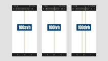
vw (Viewport Width): 1vw is equal to 1% of the viewport’s width.
vh (Viewport Height): 1vh is equal to 1% of the viewport’s height.
vmin (Viewport Minimum): The smaller value between vw and vh.
vmax (Viewport Maximum): The larger value between vw and vh.
These units are particularly useful for designing layouts that adjust dynamically based on screen size, making them ideal for full-page backgrounds, flexible typography, and responsive UI components.
1. Understanding Each Viewport Unit with Examples
1.1. Viewport Width (vw)
vw is useful when defining width-based elements that should scale with the viewport width.
Example: Full-width container
.container {
width: 100vw; /* Takes the full width of the viewport */
height: 50vh;
background-color: lightblue;
}
If the viewport width is 1200px, 100vw would be 1200px, and 50vh would be half the screen height.
1.2. Viewport Height (vh)
vh helps when defining height-based elements that should scale with the viewport height.
Example: Fullscreen section
.fullscreen {
width: 100vw;
height: 100vh; /* Fills the entire height of the screen */
background-color: black;
color: white;
display: flex;
justify-content: center;
align-items: center;
font-size: 3vw;
}
This will create a full-height, full-width section that adjusts automatically when the viewport changes.
1.3. Viewport Minimum (vmin)
vmin takes the smaller value between vw and vh, making it ideal for responsive typography.
Example: Responsive text size
.responsive-text {
font-size: 5vmin; /* Adapts based on the smallest viewport dimension */
color: darkblue;
}
If the viewport is 800x600px, the vmin unit will be based on 600px, so 5vmin = 30px.
1.4. Viewport Maximum (vmax)
vmax takes the larger value between vw and vh, making it useful for elements that should be proportional to the largest viewport dimension.

Example: Proportional Button
.button {
width: 10vmax; /* Scales with the larger dimension */
height: 5vmax;
font-size: 2vmax;
background-color: crimson;
color: white;
border: none;
cursor: pointer;
}
On a 1000x600px screen, vmax = 1000px, so 10vmax = 100px.
2. Practical Use Cases of Viewport Units
2.1. Full-Screen Hero Section
.hero {
width: 100vw;
height: 100vh;
background-image: url('background.jpg');
background-size: cover;
background-position: center;
display: flex;
align-items: center;
justify-content: center;
font-size: 5vw;
color: white;
}
This ensures a full-screen hero banner that always fits the viewport.
2.2. Fluid Typography
h1 {
font-size: 8vmin; /* Text scales based on the smaller viewport dimension */
text-align: center;
margin-top: 10vh;
}
This ensures headings remain proportional across all devices.
2.3. Flexible Grid Layout
.grid-container {
display: grid;
grid-template-columns: repeat(auto-fit, minmax(20vw, 1fr));
gap: 2vmin;
}
.grid-item {
background-color: lightgray;
padding: 5vmin;
text-align: center;
}
This layout automatically adapts to the screen size.
3. Common Mistakes & How to Avoid Them
3.1. Scrollbars with 100vw
Issue: 100vw may cause horizontal scrolling due to scrollbars.
Fix: Use max-width: 100% or overflow-x: hidden.
body {
overflow-x: hidden;
}
3.2. Font Sizes That Get Too Small or Too Large
Solution: Use clamp() to restrict size range.
h1 {
font-size: clamp(16px, 5vw, 50px);
}
Ensures a minimum (16px), preferred (5vw), and maximum (50px).
4. Exercises for Practice
Exercise 1: Create a Full-Screen Landing Page
Create a hero section that fills the viewport, with a title in the center that scales dynamically.
Task:
Set the width to 100vw and height to 100vh.
Add a background image and center the text using display: flex.
Make the text size 5vmin.
Exercise 2: Build a Responsive Card Grid
Create a grid layout where each card scales dynamically.

Task:
Use grid-template-columns: repeat(auto-fit, minmax(20vw, 1fr)).
Set padding of cards to 2vmin.
Ensure a gap of 3vmin between cards.
Exercise 3: Make a Button that Scales Based on Viewport Size
Create a button that adjusts its size based on vmax.
Task:
Set width as 10vmax and height as 5vmax.
Use font-size: 2vmax.
Set background color to blue and text color to white.
5. Conclusion
Viewport units (vw, vh, vmin, vmax) are essential for creating fully responsive designs that adjust dynamically to different screen sizes. They are particularly useful for:
Full-screen layouts
Fluid typography
Flexible grid systems
Responsive buttons and UI elements
By practicing the exercises above, you will be able to create flexible and scalable designs that look great on any device.


No comments:
Post a Comment