Module 24 : CSS Aspect Ratio & Object Fit – Handling Responsive Images and Videos
Introduction
When designing responsive websites, ensuring images and videos look good across different screen sizes is crucial. CSS provides two powerful tools for handling media responsiveness:
Aspect Ratio – Maintains a consistent width-to-height ratio for elements.
Object Fit – Controls how an image or video is resized to fit its container without distortion.
1. Understanding Aspect Ratio in CSS
What is Aspect Ratio?
Aspect ratio is the proportional relationship between an element's width and height. It is expressed as:
Aspect Ratio
=
Width
Height
Aspect Ratio=
Height
Width
For example:
16:9 is a common aspect ratio for videos.
4:3 is used in older television formats.
1:1 is a perfect square.
Using the aspect-ratio Property
CSS introduced the aspect-ratio property to control an element’s width-to-height ratio easily.
Example 1: Fixed Aspect Ratio for Images
.image-container {
width: 100%; /* Responsive width */
aspect-ratio: 16 / 9; /* Maintain a 16:9 ratio */
background: url('image.jpg') center/cover no-repeat;
}
✅ Explanation:
The container will always maintain a 16:9 aspect ratio regardless of its width.
The background property ensures the image covers the entire container.

Example 2: Aspect Ratio for Videos
.video-container {
width: 100%;
aspect-ratio: 16 / 9;
}
.video-container video {
width: 100%;
height: 100%;
object-fit: cover;
}
✅ Explanation:
The aspect-ratio: 16/9; ensures the video always maintains a 16:9 ratio.
The object-fit: cover; ensures the video fills the container properly without distortion.
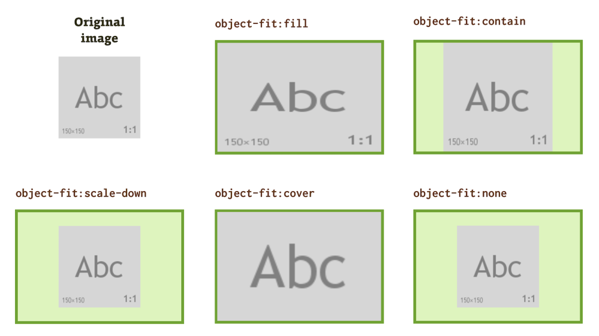
2. Understanding Object Fit in CSS
What is Object Fit?
The object-fit property controls how an image or video fits inside its container.
Syntax:
img {
object-fit: value;
}
Values of object-fit
Value Description
cover Scales the image/video to fill the container while maintaining its aspect ratio. Some parts may be cropped.
contain Scales the image/video to fit inside the container without cropping. It may leave empty spaces.
fill Stretches the image to completely fill the container, even if it distorts.
none Keeps the original size of the image/video. Overflow may occur.
scale-down Similar to none or contain, whichever results in a smaller size.

Example 3: Object Fit in Images
img {
width: 100%;
height: 300px;
object-fit: cover;
}
✅ Explanation:
The image is forced into a 300px height while maintaining its aspect ratio.
If necessary, parts of the image are cropped to ensure it completely fills the space.
Example 4: Using object-fit: contain;
img {
width: 100%;
height: 300px;
object-fit: contain;
}
✅ Explanation:
The entire image fits within 300px height without cropping, even if there is empty space.
3. Combining Aspect Ratio and Object Fit
You can combine both properties to create responsive media elements that maintain aspect ratio while fitting properly within containers.
Example 5: Responsive Video with Aspect Ratio and Object Fit
.video-container {
width: 100%;
aspect-ratio: 16 / 9;
background-color: black;
}
.video-container video {
width: 100%;
height: 100%;
object-fit: cover;
}
✅ Explanation:
The .video-container ensures the video maintains a 16:9 aspect ratio.
The object-fit: cover; ensures the video fills the container without distortion.
4. Practical Exercises
Exercise 1: Create a Responsive Image Gallery

Create a simple image gallery where all images maintain a 1:1 aspect ratio and fill their containers.
Use object-fit: cover; to ensure images look good inside different screen sizes.
✅ Code Example:
<div class="gallery">
<img src="image1.jpg" alt="Gallery Image">
<img src="image2.jpg" alt="Gallery Image">
<img src="image3.jpg" alt="Gallery Image">
</div>
<style>
.gallery {
display: grid;
grid-template-columns: repeat(3, 1fr);
gap: 10px;
}
.gallery img {
width: 100%;
aspect-ratio: 1 / 1;
object-fit: cover;
}
</style>
Exercise 2: Make a Responsive Video Player
Embed a YouTube video and ensure it maintains a 16:9 aspect ratio.
Ensure it fits inside any container using object-fit.
✅ Code Example:
<div class="video-wrapper">
<iframe src="https://www.youtube.com/embed/xyz123" allowfullscreen></iframe>
</div>
<style>
.video-wrapper {
width: 100%;
aspect-ratio: 16 / 9;
}
.video-wrapper iframe {
width: 100%;
height: 100%;
object-fit: cover;
}
</style>
5. : Dynamic Aspect Ratio Adjustments
Objective:
To dynamically change aspect ratios and object-fit values and observe their effects on images/videos.

Steps:
Create a container with an image inside.
Use a dropdown to allow users to switch between different aspect-ratio and object-fit values.
Observe how the image resizes.
✅ Code Example:
<select id="aspectRatioSelect">
<option value="16/9">16:9</option>
<option value="4/3">4:3</option>
<option value="1/1">1:1</option>
</select>
<select id="objectFitSelect">
<option value="cover">Cover</option>
<option value="contain">Contain</option>
<option value="fill">Fill</option>
</select>
<div class="image-container">
<img src="image.jpg" id="image">
</div>
<style>
.image-container {
width: 100%;
aspect-ratio: 16 / 9;
}
.image-container img {
width: 100%;
height: 100%;
object-fit: cover;
}
</style>
<script>
document.getElementById("aspectRatioSelect").addEventListener("change", function() {
document.querySelector(".image-container").style.aspectRatio = this.value;
});
document.getElementById("objectFitSelect").addEventListener("change", function() {
document.getElementById("image").style.objectFit = this.value;
});
</script>
✅ Experiment Results:
Changing aspect-ratio affects the container’s size.
Changing object-fit changes how the image scales within the container.
Conclusion
The aspect-ratio property ensures elements maintain a consistent width-to-height ratio.
The object-fit property controls how images/videos fit within their containers.
Using both together helps create fully responsive media elements for different screen sizes.


No comments:
Post a Comment