Module 22 : CSS Frameworks Overview – Introduction to Bootstrap, Tailwind, and Foundation.
comprehensive introduction to CSS frameworks, focusing on Bootstrap, Tailwind CSS, and Foundation. You will learn how these frameworks simplify web design, how to use them effectively, and when to choose one over another. The module includes practical exercises, real-world examples, and lab experiments to solidify your understanding.
1. Introduction to CSS Frameworks
What is a CSS Framework?
A CSS framework is a pre-prepared library that provides ready-made CSS classes and components to speed up web development. These frameworks help developers create responsive, visually appealing, and functional designs without writing extensive CSS from scratch.
Why Use CSS Frameworks?
Saves time by using pre-defined styles
Ensures consistency across web pages
Provides built-in responsive design
Reduces browser compatibility issues
Enhances maintainability of code
Types of CSS Frameworks
UI-Based Frameworks (Bootstrap, Foundation)
Comes with pre-styled UI components (buttons, grids, navbars, etc.)
Great for fast development with consistent design
Utility-First Frameworks (Tailwind CSS)
Uses small utility classes for flexible and custom designs
More control over styling without overriding pre-defined components
2. Introduction to Bootstrap
What is Bootstrap?
Bootstrap is a popular front-end framework for developing responsive and mobile-first websites. It includes CSS and JavaScript components for easy styling and interactivity.
Key Features of Bootstrap
Responsive Grid System – Flexible layout structure
Pre-Styled Components – Buttons, cards, modals, etc.
JavaScript Plugins – Dropdowns, sliders, tooltips
Customizable – Modify using SASS variables
Installing Bootstrap
Method 1: Using CDN
The simplest way to use Bootstrap is through a CDN (Content Delivery Network).
<!DOCTYPE html>
<html lang="en">
<head>
<meta charset="UTF-8">
<meta name="viewport" content="width=device-width, initial-scale=1.0">
<title>Bootstrap Example</title>
<link href="https://cdn.jsdelivr.net/npm/bootstrap@5.3.0/dist/css/bootstrap.min.css" rel="stylesheet">
</head>
<body>
<h1 class="text-center text-primary">Hello, Bootstrap!</h1>
</body>
</html>
Method 2: Installing via NPM
If you're working on a project with build tools like Webpack, install Bootstrap via NPM:
npm install bootstrap
Then, import Bootstrap into your CSS or JavaScript file:
@import 'bootstrap/dist/css/bootstrap.min.css';
Basic Bootstrap Components
1. Bootstrap Grid System
Bootstrap uses a flexbox-based 12-column grid for responsive layouts.
<div class="container">
<div class="row">
<div class="col-md-6 bg-primary text-white">Column 1</div>
<div class="col-md-6 bg-secondary text-white">Column 2</div>
</div>
</div>
2. Bootstrap Buttons
<button class="btn btn-primary">Primary Button</button>
<button class="btn btn-success">Success Button</button>
3. Bootstrap Navbar
<nav class="navbar navbar-expand-lg navbar-dark bg-dark">
<a class="navbar-brand" href="#">My Website</a>
</nav>
Bootstrap Lab Exercise
Task: Create a responsive landing page using Bootstrap components:
Header with navigation
Hero section with a call-to-action button
Three-column feature section
3. Introduction to Tailwind CSS
What is Tailwind CSS?
Tailwind CSS is a utility-first CSS framework that allows you to style elements directly in your HTML using classes.
Key Features of Tailwind CSS
Utility-First Approach – No pre-designed UI components
Highly Customizable – Uses configuration files
Responsive Design – Mobile-first classes
Performance Optimization – Purges unused styles in production
Installing Tailwind CSS
Method 1: Using CDN (for quick testing)
<link href="https://cdn.jsdelivr.net/npm/tailwindcss@3.0.0/dist/tailwind.min.css" rel="stylesheet">
Method 2: Installing via NPM (Recommended)
npm install tailwindcss
Then, create a configuration file:
npx tailwindcss init
Basic Tailwind CSS Usage
1. Utility-Based Styling
<h1 class="text-3xl font-bold text-blue-600">Hello, Tailwind CSS!</h1>
2. Flexbox Layout
<div class="flex justify-center items-center h-screen bg-gray-100">
<p class="text-lg text-gray-700">Centered Content</p>
</div>
3. Responsive Design
<div class="grid grid-cols-1 md:grid-cols-2 lg:grid-cols-3 gap-4">
<div class="bg-blue-500 p-5">Box 1</div>
<div class="bg-green-500 p-5">Box 2</div>
<div class="bg-red-500 p-5">Box 3</div>
</div>
Tailwind CSS Lab Exercise
Task: Build a custom portfolio page using Tailwind CSS:
Navbar with flexbox
Hero section with gradient background
Grid layout for projects
4. Introduction to Foundation
What is Foundation?
Foundation is a responsive front-end framework developed by Zurb. It focuses on flexibility, accessibility, and responsiveness.
Key Features of Foundation
Responsive Grid System
Modular Components (buttons, cards, menus)
ARIA Support for accessibility
SASS Integration
Installing Foundation
Method 1: Using CDN
<link rel="stylesheet" href="https://cdn.jsdelivr.net/npm/foundation-sites/dist/css/foundation.min.css">
Method 2: Installing via NPM
npm install foundation-sites
Basic Foundation Usage
1. Grid System
<div class="grid-container">
<div class="grid-x grid-margin-x">
<div class="cell small-6 medium-4 large-3">Box 1</div>
<div class="cell small-6 medium-4 large-3">Box 2</div>
</div>
</div>
2. Buttons
<button class="button success">Success Button</button>
<button class="button alert">Alert Button</button>
3. Responsive Menu
<ul class="menu">
<li><a href="#">Home</a></li>
<li><a href="#">About</a></li>
</ul>
Foundation Lab Exercise
Task: Create a blog layout using Foundation:
Header with navigation
Grid-based article previews
Responsive footer
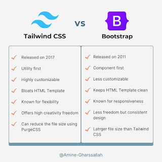
5. Comparison: Bootstrap vs Tailwind vs Foundation
Feature Bootstrap Tailwind Foundation
Styling Approach Pre-styled components Utility-first Modular components
Customization Moderate High High
Learning Curve Easy Moderate Moderate
Best For Rapid prototyping Custom design Responsive & accessible UI
Final Project: Build a Complete Web Page
Task: Choose one framework (Bootstrap, Tailwind, or Foundation) and build a multi-section website with:
A navbar
A hero section
A services or portfolio section
A footer


No comments:
Post a Comment