Css Module 43
If You want To Earn Certificate For My All Course Then Contact Me At My Contact Page then I Will Take A Test And Give You certificate
Click Here To Visit
Css Module 43
If You want To Earn Certificate For My All Course Then Contact Me At My Contact Page then I Will Take A Test And Give You certificate
Click Here To Visit
Module 43 : Using SCSS preprocessors
Module Objectives:
By the end of this module, learners will be able to:
Understand the role of preprocessors in modern CSS development.
Use variables to store reusable values.
Create and apply mixins for reusable chunks of CSS.
Write custom functions for dynamic CSS logic.
Apply SCSS in a project using experiments.
1. Introduction to CSS Preprocessors

CSS preprocessors like SASS (Syntactically Awesome Style Sheets) extend CSS with features like variables, nesting, mixins, and functions.
Why Use SASS?
Maintainability: Cleaner and modular code.
Reusability: Avoid repetition.
Logic in Stylesheets: Conditionals, loops, and functions.
2. Variables in SASS/SCSS
Explanation:
Variables store values (e.g., colors, spacing, fonts) that you can reuse throughout your stylesheets.
Syntax:
scss
code
$primary-color: #3498db; $padding-base: 1rem; body { background-color: $primary-color; padding: $padding-base; }
Example:
scss
code
$font-stack: 'Segoe UI', Tahoma, Geneva, Verdana, sans-serif; $heading-color: #2c3e50; h1, h2, h3 { font-family: $font-stack; color: $heading-color; }
Exercise 1:
Task: Create a button using variables for background color, text color, and padding.
Expected Output:
scss
code
$btn-bg: #e74c3c; $btn-text: #fff; $btn-padding: 10px 20px; .button { background-color: $btn-bg; color: $btn-text; padding: $btn-padding; border: none; border-radius: 5px; }
3. Mixins in SASS/SCSS

Explanation:
Mixins let you define a group of CSS declarations that you can reuse throughout your stylesheet.
Syntax:
scss
code
@mixin border-radius($radius) { border-radius: $radius; -webkit-border-radius: $radius; -moz-border-radius: $radius; } .box { @include border-radius(10px); }
Example:
scss
code
@mixin flex-center { display: flex; justify-content: center; align-items: center; } .container { @include flex-center; height: 100vh; }
Exercise 2:
Task: Create a mixin for a box-shadow with default and custom parameters.
Expected Output:
scss
code
@mixin box-shadow($x: 0px, $y: 2px, $blur: 5px, $color: rgba(0, 0, 0, 0.1)) { box-shadow: $x $y $blur $color; } .card { @include box-shadow; } .alert { @include box-shadow(0px, 4px, 10px, rgba(255, 0, 0, 0.2)); }
4. Functions in SASS/SCSS
Explanation:
Functions perform calculations and return values. Great for dynamic values like spacing, font sizes, or color manipulation.
Syntax:
scss
code
@function em($px, $base: 16) { @return ($px / $base) * 1em; } .text { font-size: em(18); }
Example:
scss code
@function spacing($multiplier) { @return $multiplier * 8px; } .card { padding: spacing(2); // 16px margin: spacing(3); // 24px }
Exercise 3:
Task: Create a function that darkens a color based on a percentage.
Expected Output:
scss
code
@function darken-color($color, $percent) { @return darken($color, $percent); } .btn { background-color: darken-color(#3498db, 10%); }
5. Build a Reusable SCSS UI Kit

Objective:
Build a mini design system using SCSS with variables, mixins, and functions.
Step-by-Step Lab Instructions:
Step 1: Set Up Project Structure
text
code
/project-root |-- /scss | |-- _variables.scss | |-- _mixins.scss | |-- _functions.scss | |-- main.scss
Step 2: Define Variables _variables.scss
scss
code
$primary-color: #1abc9c; $secondary-color: #2c3e50; $base-padding: 12px; $font-base: 'Roboto', sans-serif;
Step 3: Create Mixins _mixins.scss
scss
code
@mixin transition($prop...) { transition: $prop 0.3s ease-in-out; } @mixin responsive($breakpoint) { @if $breakpoint == 'tablet' { @media (max-width: 768px) { @content; } } @else if $breakpoint == 'mobile' { @media (max-width: 480px) { @content; } } }
Step 4: Write Functions _functions.scss
scss
code
@function rem($px, $base: 16) { @return ($px / $base) * 1rem; }
Step 5: Use in Main Stylesheet main.scss
scss
code
@import 'variables', 'mixins', 'functions'; body { font-family: $font-base; padding: $base-padding; } .button { background: $primary-color; color: #fff; padding: rem(14) rem(24); @include transition(all); @include responsive('mobile') { padding: rem(10) rem(20); } }
Expected Outcome: A clean, modular SCSS-based styling system that adapts across devices and reuses components efficiently.
6. Summary
Variables keep your code DRY and make global changes easy.

Mixins reduce repetition by encapsulating common patterns.
Functions bring logic to styles and enable dynamic calculations.
SASS improves code organization and maintenance significantly.
7. Assessment Questions
What are the benefits of using mixins over repeating code blocks?
How do SCSS functions differ from mixins?
Create a mixin for a button with custom padding, background color, and text color.
8. Final Exercise
Project Task: Build a responsive card component using:
Variables for spacing and colors.
A mixin for shadows.
A function to convert pixels to rem.
Css Module 42
If You want To Earn Certificate For My All Course Then Contact Me At My Contact Page then I Will Take A Test And Give You certificate
Click Here To Visit
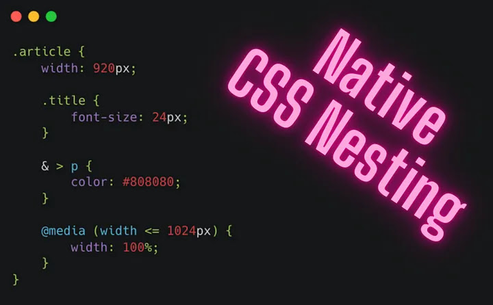
Module 42 : CSS Nesting with PostCSS – Writing Modular and Maintainable CSS

This module introduces the concept of CSS nesting using PostCSS, a powerful tool for transforming CSS with JavaScript. You'll learn how to write modular, maintainable, and cleaner CSS by nesting selectors logically, similar to how it's done in SCSS. The module will also guide you on how to set up PostCSS, structure nested styles efficiently, and avoid common pitfalls.
Learning Objectives:
By the end of this module, learners will be able to:
Understand what CSS nesting is and why it's useful.
Set up PostCSS with the nesting plugin.
Write clean and maintainable nested CSS.
Avoid deep nesting and specificity issues.
Integrate nesting into modular CSS architectures (like BEM or utility-first).
Use PostCSS nesting in real projects.
Section 1: Introduction to CSS Nesting
What is CSS Nesting?
CSS Nesting allows you to nest selectors inside one another, similar to SCSS. This makes it easier to see the relationship between elements and maintain hierarchical styles.
Why Nesting?
Reduces repetition.
Improves readability.
Keeps related styles together.
Helps enforce a component-based structure.
Example (Vanilla CSS vs. Nested CSS)
Without nesting:
css
code
.card { ... } .card .card-title { ... } .card .card-body { ... } .card .card-footer { ... }
With nesting:
css
code
.card { ... .card-title { ... } .card-body { ... } .card-footer { ... } }
Section 2: Setting Up PostCSS for Nesting
Step-by-step Setup

1. Initialize a project:
bash
code
npm init -y
2. Install required packages:
bash
code
npm install postcss postcss-cli postcss-nesting autoprefixer --save-dev
3. Create a postcss.config.js:
js
code
module.exports = { plugins: [ require('postcss-nesting'), require('autoprefixer') ] }
4. Create a CSS file (src/style.css) using nesting:
css
code
.button { padding: 1rem; background: blue; &:hover { background: darkblue; } span { color: white; } }
5. Build CSS with CLI:
bash code
npx postcss src/style.css -o dist/style.css
Section 3: Writing Modular and Maintainable Nested CSS
Best Practices:
1. Limit Nesting Depth (Max 2-3 levels)
Too deep nesting increases specificity and becomes hard to read.
css
code
/* Bad */ .card { .header { .title { .icon { color: red; /* Too deep */ } } } }
css
code
/* Good */ .card { .header { ... } .title { ... } }
2. Use BEM with Nesting
Use nesting to simplify BEM syntax:
css
code
.card { &__title { ... } &__body { ... } }
3. Avoid Nesting Modifiers
Instead of:
css
code
.card { &.is-active { background: green; } }
Prefer using utility classes or parent selectors where possible.
Section 4: Practical Exercise – Building a Nested Component
Objective:
Create a reusable ProfileCard component using CSS nesting and PostCSS.
HTML:
html
code
<div class="profile-card"> <div class="profile-card__avatar"></div> <div class="profile-card__info"> <h2 class="profile-card__name">Jane Doe</h2> <p class="profile-card__bio">Frontend Developer</p> </div> </div>
Nested CSS:
css
code
.profile-card { display: flex; padding: 1rem; background-color: #fff; &__avatar { width: 80px; height: 80px; background: gray; border-radius: 50%; } &__info { margin-left: 1rem; &__name { font-weight: bold; } &__bio { color: #666; } } }
Refactored (Correct):
css
code
.profile-card { display: flex; padding: 1rem; background-color: #fff; &__avatar { width: 80px; height: 80px; background: gray; border-radius: 50%; } &__info { margin-left: 1rem; } &__name { font-weight: bold; } &__bio { color: #666; } }
Explanation:
Initially, the &__name and &__bio were nested inside &__info, which can complicate the hierarchy and debugging. Flattening them while keeping nesting under control improves maintainability.
Section 5: Exercises
Exercise 1 – Refactor Flat CSS
Take a flat CSS file and refactor it using PostCSS Nesting while following best practices.

Exercise 2 – Component Nesting Challenge
Given a UI component structure (e.g., navigation menu), write nested CSS using PostCSS.
Exercise 3 – Analyze and Fix Bad Nesting
Identify issues in a badly nested file and refactor it.
Section 6: Common Pitfalls & Debugging
1. Over-Nesting
Avoid .a .b .c .d .e {} type selectors.
2. Specificity Clashes
Avoid relying on nesting for specificity — use class names and utility-first approaches.
3. Plugin Conflicts
Ensure PostCSS is not using conflicting plugins or misordered plugins.
Section 7: Summary and Best Practices

Nest only when it improves clarity.
Keep nesting depth to 2–3 levels max.
Combine with BEM or utility CSS.
Always lint and auto-format nested styles for consistency.
Assignment (For Students)
Build a full UI component (like a card, navbar, or sidebar) using PostCSS with nesting.
Deliverables:
PostCSS config
Source CSS with nesting
Compiled output
A brief summary of nesting decisions made
Additional Resources
PostCSS Nesting Plugin Docs
MDN Web Docs – CSS Nesting
BEM Methodology
Css Module 41
If You want To Earn Certificate For My All Course Then Contact Me At My Contact Page then I Will Take A Test And Give You certificate
Click Here To Visit
Module 41 : Understand what CSS Houdini
Objective:
Understand what CSS Houdini is, why it matters, how it extends the capabilities of CSS, and how to use Custom Properties (variables) with Houdini for powerful, dynamic, and performant web styling.
2. What is CSS Houdini?
Definition:

CSS Houdini is a set of low-level APIs that allow developers to extend CSS by writing JavaScript that the browser can understand as if it were native CSS.
Why Houdini?
Traditionally, CSS is limited—you can't define new CSS features without waiting for browser vendors.
Houdini bridges the gap between CSS and JavaScript, giving devs the power to create custom styles, layouts, animations, and more.
It allows browsers to parse and render custom styles much faster than traditional JS + DOM manipulation.
3. CSS Houdini APIs Overview
Houdini includes several APIs:
API
Purpose
CSS Typed OM API
Works with CSS values as JS objects instead of strings
Paint Worklet API
Custom drawing with JavaScript (like canvas in CSS)
Layout Worklet API
Create custom layout algorithms
Animation Worklet API
Run animations off the main thread
Properties & Values API
Define and register custom CSS properties
This module focuses on Properties & Values API, essential for understanding Houdini and custom properties.
4. What are Custom Properties?
Custom Properties are variables defined in CSS using --name.
Example:
css
code
:root { --main-color: #3498db; } .box { background-color: var(--main-color); }
5. Registering Custom Properties with Houdini

Why Register?
Normally, CSS variables are treated as generic strings. Registering a property gives the browser more information:
Its type (e.g., <color>, <length>)
Default value
Whether it inherits
This improves performance and enables advanced features (like animations, typed values, etc.).
6. How to Register Custom Properties (Step-by-step)
Step 1: Enable Houdini in Browser
Make sure your browser supports Houdini (latest Chrome, Edge, etc.).
Step 2: Use CSS.registerProperty()
javascript
code
if ('registerProperty' in CSS) { CSS.registerProperty({ name: '--magic-color', syntax: '<color>', inherits: false, initialValue: '#ff00ff' }); }
Now you can use --magic-color in your CSS and it will be treated like a native <color> property.
7. Practical Example: Animating a Custom Color Property
HTML + CSS + JS
html
code
<div class="magic-box"></div> <style> .magic-box { width: 200px; height: 200px; background-color: var(--magic-color, #000); transition: --magic-color 1s ease-in-out; } .magic-box:hover { --magic-color: #00ff00; } </style> <script> if ('registerProperty' in CSS) { CSS.registerProperty({ name: '--magic-color', syntax: '<color>', inherits: false, initialValue: '#ff00ff' }); } </script>
Explanation:
We register --magic-color as a <color> type.
CSS can now animate this property like a native background-color.
On hover, the color transitions smoothly because the browser understands it's a <color>.
8. Custom Progress Bar with Animated Variable

Objective:
Create a progress bar that uses a custom property --progress (type <percentage>) and animates it.
HTML + CSS + JS:
html
code
<div class="progress-container"> <div class="progress-bar"></div> </div> <style> .progress-container { width: 100%; height: 20px; background: #eee; overflow: hidden; border-radius: 10px; } .progress-bar { height: 100%; background: linear-gradient(to right, #76c7c0, #4b9e9e); transform: scaleX(calc(var(--progress) / 100)); transform-origin: left; transition: --progress 1s ease; } </style> <script> if ('registerProperty' in CSS) { CSS.registerProperty({ name: '--progress', syntax: '<percentage>', inherits: false, initialValue: '0%' }); } const progressBar = document.querySelector('.progress-bar'); // Simulate progress let progress = 0; setInterval(() => { progress += 10; if (progress > 100) progress = 0; progressBar.style.setProperty('--progress', `${progress}%`); }, 1000); </script>
Explanation:
Registers a <percentage> custom property.
Uses it in transform: scaleX() to visually grow the bar.
Transitions are smooth due to typed registration.
9. Exercise
Register a custom property --angle with syntax <angle>.
Apply it to rotate an image on hover with animation.
Make it rotate from 0deg to 45deg.
Hint:
css
code
transform: rotate(var(--angle)); transition: --angle 0.5s;
10. Best Practices
Always check browser support with if ('registerProperty' in CSS) to avoid breaking old browsers.
Use fallback values with var(--prop, fallback).
Register custom properties before using them.
Use typed values to unlock animation capabilities.
11. Summary

Feature
Benefit
Custom Properties
Reusable and dynamic styling
Houdini registerProperty
Performance boost and animation support
Typed Syntax
CSS can handle properties natively
Smooth Animations
Registering properties enables browser-native transitions
12. Extension (Optional): Dynamic Themes
Goal:
Create a theme switcher using registered --theme-color property.
Try it:
Define two themes (light/dark)
Use JavaScript to switch --theme-color and see animation.
13. Use Cases
Animated gradients
Advanced theming
Dynamic charts with CSS-driven transitions
Visual effects (like waves, shapes) with Paint API + custom props
14. Final Thoughts
CSS Houdini is the future of dynamic styling. Mastering custom properties with Houdini will give you:
More control
Better performance
Creative freedom beyond standard CSS limitations
Css Module 40
If You want To Earn Certificate For My All Course Then Contact Me At My Contact Page then I Will Take A Test And Give You certificate
Click Here To Visit
Module 40 :
1. Introduction to CSS Performance

Why CSS Performance Matters:
CSS may seem lightweight, but inefficient rules and bloated stylesheets can slow down:
Render times (FCP – First Contentful Paint)
Repaints and reflows
Time to Interactive (TTI)
How CSS Affects the Browser:
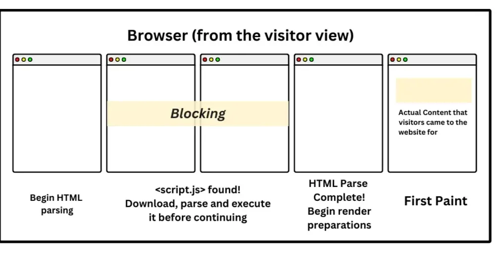
CSS is render-blocking. Until it's fully downloaded and parsed, the page won't render.
The browser constructs the CSSOM (CSS Object Model) alongside the DOM, and combines them into the Render Tree.
Complex or inefficient styles slow this pipeline.
2. Writing Efficient CSS:
A. Keep Selectors Short and Simple
Inefficient:
css
code
html body div.container ul li span.label { color: red; }
Efficient:
css
code
.label { color: red; }
Explanation:
Deep selectors force the browser to evaluate multiple levels.
Flat selectors target elements directly.
Tip: Use class selectors instead of tag or descendant selectors.
B. Avoid the Universal Selector * and Overly Generic Rules
Example:
css
code
* { margin: 0; padding: 0; }
While reset styles are useful, * can be costly in large DOMs.
Alternative: Use a scoped reset:
css
code
body, h1, h2, p, ul, ol { margin: 0; padding: 0; }
C. Use Shorthand Properties
Reduces CSS file size and parsing time.
Instead of:
css
code
margin-top: 10px; margin-right: 10px; margin-bottom: 10px; margin-left: 10px;
Use:
css
code
margin: 10px;
D. Avoid Inline Styles and !important
Inline styles increase HTML size and reduce maintainability.
!important breaks cascading and makes styles harder to override.
E. Minimize Repaints and Reflows
CSS rules like width, height, margin, and position can trigger reflows.
Example: Changing top, left, or width dynamically can reflow the layout.
Optimization:
Use CSS transforms and opacity changes for animations:
css
code
.element { transform: translateX(100px); opacity: 0.5; }
F. Limit Use of Complex Pseudo-Selectors
Bad:
css
code
ul li:nth-child(2n+1):hover { background-color: yellow; }
Instead, try using a utility class:
css
code
<li class="odd">...</li>
G. Use Critical CSS
Load only above-the-fold styles in the initial render, defer the rest.

Tools:
Critical by Addy Osmani
webpack plugins for critical CSS
Example:
html
code
<style> /* Critical CSS inline here */ </style> <link rel="stylesheet" href="main.css" media="print" onload="this.media='all';">
H. Remove Unused CSS
Tools like:
PurgeCSS
UnCSS
Chrome DevTools Coverage tab
These can help eliminate unnecessary rules, especially in large frameworks like Bootstrap.
3. Hands-on Exercises
Exercise 1: Optimize Bloated Selectors
Given:
css
code
div#main-content .container .article h2.title { color: blue; }
Refactor this to make it more efficient.
Answer:
css
code
.title { color: blue; }
Explanation: The class .title should uniquely identify the element.
Exercise 2: Critical CSS Extraction
Open a landing page design.
Identify visible content in the viewport.
Copy associated styles into an inline <style> block.
Defer loading the full stylesheet.
Exercise 3: Audit and Optimize a CSS File
Tools:

Chrome DevTools > Coverage
PurgeCSS
Steps:
Load a webpage with a large CSS file.
Use Coverage tab to identify unused rules.
Use PurgeCSS to remove them.
Measure file size before and after.
4. Example: Optimizing a Blog Template
Before Optimization:
CSS file size: 230KB
Deep selectors: .blog-post .content > p:first-child
Uses 5 Google Fonts
Animates with top and left
After Optimization:
CSS file size: 80KB
Flat selectors and utility classes
Font stack limited to 1 custom font
Uses transform for animation
Results:
Load time improved by 45%
First Contentful Paint dropped from 1.8s to 1.1s
5. Performance Tools and Testing
Tools to Use:
Lighthouse (Chrome)
WebPageTest
Chrome DevTools – Performance and Coverage tabs
6. Summary of Best Practices
Tip
Why It Helps
Short, flat selectors
Faster evaluation
Use classes over tags or IDs
Easier to manage, better specificity control
Minimize CSS
Reduces download time
Remove unused styles
Cleaner, faster CSSOM
Critical CSS
Improves First Paint
Avoid complex pseudo-classes
Better selector performance
FormatS
1: What happens in the browser (CSSOM, Render Tree)
CSS as render-blocking resource
2: Writing efficient selectors

3: Exercises: Refactor and audit code
Tools: Lighthouse, PurgeCSS
4: Critical CSS & Lazy Loading
CSS for performance in frameworks (Tailwind, Bootstrap)
Homework/Assignment
Project Task:
Take an existing webpage and:
Minimize selector depth
Remove unused rules
Extract critical CSS
Measure performance improvement (before/after)
Module 38 : Responsive & Advanced Tables. 1. Introduction to Tables in Web Design Tables are used to display structured, relational d...


