Module : 14 CSS Grid Advanced – Grid Template Areas, Grid Auto-Flow, Implicit & Explicit Grids
This module focuses on advanced CSS Grid concepts, including grid template areas, grid-auto-flow, implicit grids, and explicit grids. By the end of this module, learners will be able to create flexible, responsive grid layouts and optimize their design workflow using advanced CSS Grid properties.
Learning Outcomes
Understand grid template areas and how to use them for semantic layouts.
Learn the role of grid-auto-flow and how to control element placement dynamically.
Differentiate between implicit and explicit grids and apply them effectively.
Practice building complex layouts with hands-on exercises.
1. Understanding Grid Template Areas
What is Grid Template Areas?
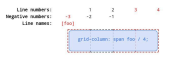
Grid template areas allow you to define named sections in your grid layout using a readable and structured format. Instead of working with numbers and fractions, you assign names to areas and place elements accordingly.
How to Use Grid Template Areas
Define the grid container with display: grid
Use grid-template-areas to define the layout structure
Assign grid items to the named areas using grid-area
Example: A Simple Page Layout

.container {
display: grid;
grid-template-columns: 200px 1fr 200px; /* Sidebar - Main Content - Sidebar */
grid-template-rows: 100px 1fr 50px; /* Header - Content - Footer */
grid-template-areas:
"header header header"
"sidebar main sidebar"
"footer footer footer";
gap: 10px;
}
.header { grid-area: header; background: lightblue; }
.sidebar { grid-area: sidebar; background: lightgray; }
.main { grid-area: main; background: white; }
.footer { grid-area: footer; background: lightgreen; }
<div class="container">
<div class="header">Header</div>
<div class="sidebar">Sidebar</div>
<div class="main">Main Content</div>
<div class="footer">Footer</div>
</div>
Benefits of Grid Template Areas
Improves readability – The layout is visually structured in CSS.
Easy to rearrange – Simply change the area names in grid-template-areas.
Reduces complexity – No need for multiple row/column specifications.
2. Understanding Grid Auto-Flow
What is Grid Auto-Flow?
The grid-auto-flow property controls how items are placed when no specific row/column positions are defined. The two main values are:
row (default) – Places items row by row.
column – Places items column by column.
Example: Default grid-auto-flow: row;
.container {
display: grid;
grid-template-columns: repeat(3, 100px);
grid-template-rows: 100px 100px;
grid-auto-flow: row;
gap: 5px;
}
.item {
width: 100px;
height: 100px;
background: orange;
}
<div class="container">
<div class="item">1</div>
<div class="item">2</div>
<div class="item">3</div>
<div class="item">4</div>
<div class="item">5</div>
</div>
Explanation:
Items fill rows first, moving left to right.
If a row is full, the next row starts.
Example: Using grid-auto-flow: column;
.container {
display: grid;
grid-template-columns: 100px 100px;
grid-template-rows: repeat(3, 100px);
grid-auto-flow: column;
gap: 5px;
}
Explanation:
Items will fill columns first instead of rows.
3. Implicit vs Explicit Grids
Explicit Grid

An explicit grid is when you define grid tracks (rows/columns) using grid-template-rows and grid-template-columns.
Example: Explicit Grid with Defined Columns & Rows
.container {
display: grid;
grid-template-columns: 100px 100px 100px; /* Explicitly set columns */
grid-template-rows: 100px 100px; /* Explicitly set rows */
gap: 5px;
}
Explanation:
This grid will have 3 columns and 2 rows.
Any extra items will not be placed unless handled by implicit grid rules.
Implicit Grid
An implicit grid is created automatically when elements exceed the defined grid.
Example: Implicit Rows Auto-Created
.container {
display: grid;
grid-template-columns: repeat(3, 100px);
grid-auto-rows: 100px; /* Extra items create new rows */
}
Explanation:
If more items are added beyond the explicit rows, new rows are automatically created.
Practical Exercises
Exercise 1: Recreate a Basic Dashboard Layout

Task: Build a responsive dashboard layout using grid-template-areas.
Instructions:
Header at the top
Sidebar on the left
Main content in the center
Widgets on the right
Footer at the bottom
.dashboard {
display: grid;
grid-template-columns: 200px 1fr 250px;
grid-template-rows: 80px 1fr 60px;
grid-template-areas:
"header header header"
"sidebar main widgets"
"footer footer footer";
gap: 10px;
}
.header { grid-area: header; background: darkblue; }
.sidebar { grid-area: sidebar; background: darkgray; }
.main { grid-area: main; background: white; }
.widgets { grid-area: widgets; background: lightgray; }
.footer { grid-area: footer; background: darkgreen; }
Exercise 2: Auto-Placing Items with grid-auto-flow
Task: Create a grid where new items automatically fill columns instead of rows.
Modify the CSS to:
Set grid-auto-flow: column
Observe how items are arranged.
Lecture Structure
Lecture 1: Introduction to Advanced CSS Grid
Overview of grid-template-areas, grid-auto-flow, implicit & explicit grids.
Importance of advanced CSS Grid in modern web design.
Lecture 2: Grid Template Areas
Theory and benefits.
Hands-on examples.
Best practices.
Lecture 3: Grid Auto-Flow
Understanding row vs column flow.
Auto-placement strategies.
Lecture 4: Implicit vs Explicit Grids
Differences, when to use each.
Practical implementations.
Lecture 5: Building a Responsive Layout
Combining all concepts to create a professional dashboard.
Debugging and optimizing layouts.
Final Thoughts
Mastering advanced CSS Grid will allow you to build responsive, structured, and flexible layouts with ease. Using grid-template-areas simplifies layout definition, while grid-auto-flow and implicit grids help manage dynamic content efficiently.


No comments:
Post a Comment