Module 13 : CSS Flexbox Advanced – Mastering Justify-Content, Align-Items, and Order
Introduction to Advanced Flexbox
Flexbox is a powerful CSS layout module that provides efficient ways to align and distribute space among elements in a container, even when their sizes are unknown. In this advanced module, we will explore the deeper functionalities of justify-content, align-items, and order. These properties help control alignment, spacing, and the visual arrangement of elements in a flex container.
1. Justify-Content (Main Axis Alignment)
Definition
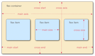
The justify-content property aligns flex items along the main axis of the flex container. The main axis is determined by the flex-direction property:
Row (default): Horizontal alignment
Column: Vertical alignment
Syntax
.container {
display: flex;
justify-content: flex-start | flex-end | center | space-between | space-around | space-evenly;
}
Values and Effects
Value Description Visual Representation
flex-start (default) Items are aligned to the start of the main axis. 🔳🔳🔳🔳🔳
flex-end Items are aligned to the end of the main axis. 🔲🔲🔲🔲🔲
center Items are centered along the main axis. 🔲🔲🔳🔳🔲🔲
space-between Items are evenly distributed with no space at the edges. 🔳 🔳 🔳 🔳 🔳
space-around Items have equal space around them. 🔲 🔳 🔲 🔳 🔲 🔳 🔲
space-evenly Items have equal space between and around them. 🔳 🔳 🔳 🔳 🔳
Example – Using Justify-Content
<!DOCTYPE html>
<html lang="en">
<head>
<meta charset="UTF-8">
<meta name="viewport" content="width=device-width, initial-scale=1.0">
<title>Flexbox Justify-Content</title>
<style>
.container {
display: flex;
justify-content: space-between;
background-color: lightgray;
padding: 20px;
}
.box {
width: 50px;
height: 50px;
background-color: steelblue;
color: white;
text-align: center;
line-height: 50px;
font-size: 18px;
}
</style>
</head>
<body>
<div class="container">
<div class="box">1</div>
<div class="box">2</div>
<div class="box">3</div>
</div>
</body>
</html>
Explanation:
The .container uses display: flex; to enable Flexbox.
justify-content: space-between; distributes elements with equal space between them.
Each .box has a set size and appears inside the .container.
2. Align-Items (Cross-Axis Alignment)
Definition
The align-items property aligns flex items along the cross axis. The cross axis is perpendicular to the main axis.
Syntax
.container {
display: flex;
align-items: stretch | flex-start | flex-end | center | baseline;
}
Values and Effects
Value Description Visual Representation
stretch (default) Items stretch to fill the height of the container. 🔳🔳🔳
flex-start Items align to the top of the cross axis. 🔳 🔳 🔳
flex-end Items align to the bottom of the cross axis. 🔲 🔲 🔲
center Items align to the center of the cross axis. 🔲 🔳 🔳 🔲
baseline Items align based on their text baselines. 🔳abc 🔳xyz 🔳123
Example – Using Align-Items
<!DOCTYPE html>
<html lang="en">
<head>
<meta charset="UTF-8">
<meta name="viewport" content="width=device-width, initial-scale=1.0">
<title>Flexbox Align-Items</title>
<style>
.container {
display: flex;
align-items: center;
height: 200px;
background-color: lightgray;
}
.box {
width: 50px;
height: 50px;
background-color: coral;
color: white;
text-align: center;
line-height: 50px;
font-size: 18px;
}
</style>
</head>
<body>
<div class="container">
<div class="box">A</div>
<div class="box">B</div>
<div class="box">C</div>
</div>
</body>
</html>
Explanation:
align-items: center; aligns the boxes vertically centered within the .container.
The container has a height of 200px, so elements are vertically adjusted accordingly.
3. Order (Controlling Flex Item Order)
Definition
The order property controls the visual order of flex items. By default, all items have order: 0;.
Syntax
.item {
order: <number>;
}
The lower the number, the earlier the item appears.
The default is order: 0;.
Negative values move an item earlier in the order.
Example – Using Order
<!DOCTYPE html>
<html lang="en">
<head>
<meta charset="UTF-8">
<meta name="viewport" content="width=device-width, initial-scale=1.0">
<title>Flexbox Order Property</title>
<style>
.container {
display: flex;
background-color: lightgray;
padding: 20px;
}
.box {
width: 50px;
height: 50px;
background-color: teal;
color: white;
text-align: center;
line-height: 50px;
font-size: 18px;
}
.box1 { order: 2; }
.box2 { order: 1; }
.box3 { order: 3; }
</style>
</head>
<body>
<div class="container">
<div class="box box1">1</div>
<div class="box box2">2</div>
<div class="box box3">3</div>
</div>
</body>
</html>
Explanation:
The second box (box2) appears first because it has order: 1;.
The first box (box1) appears second because it has order: 2;.
The third box (box3) appears last because it has order: 3;.
Conclusion and Exercises
Key Takeaways
justify-content aligns items along the main axis (horizontal in row, vertical in column).
align-items aligns items along the cross axis (vertical in row, horizontal in column).
order changes the visual order of elements without altering the HTML structure.
Exercises
Modify the justify-content value in an example and observe changes.
Experiment with different align-items values and analyze effects.
Assign custom order values to multiple elements and predict the order they will appear.
By mastering these advanced Flexbox properties, you can create dynamic, responsive layouts with ease.


No comments:
Post a Comment